I can hardly believe I typed that title. FOUR. Where does time go?!
I made something special for Chloe's first, second and third birthdays, so when Jenn asked if I had time in my "not accepting orders" fall to make Chloe's fourth birthday shirt, of course I said yes. :)
This project has a bit of a social media story.
Remember Riley's first birthday shirt? I tested that curious owl for Sheila of Savvy Stitches before it's release. Fast forward a couple months... and Sheila shares this adorable picture on her Facebook page. I was the first to comment, and the way Facebook works... :)
I almost immediately got a message from my friend Jenn asking
if I could make something similar for Chloe. I said I could make a similar shirt (since I already had),
BUT the skirt was another story. I have just not mastered the art of
garment construction. After my last reversible A-line/JonJon set I have learned to say no instead of stress
myself out.
Unbeknownst to me Jenn ordered the skirt directly from babe-a-gogo! She then sent it to me with a blank shirt to do a design for Chloe. I used the same color palette to match the skirt, but selected different fonts. This may shock faithful readers, but I did NOT use Chubby Wubby numbers from GG Designs! :) This applique 4 is from 8 Claws and a Paw's Chatty Applique, and the text is done with Candi, also from 8CP. I picked my pink chevron print to emulate the wavy lines on the belly of the owl in the fabric (also why I deleted the wings, and used aqua for the eyes and legs).
Since I personally didn't purchase the skirt, I can't leave feedback on Etsy, so let me do it here: babe-a-gogo does FANTASTIC work! The skirt is
darling and so well constructed. Seeing the
skirt in person confirms that I should not be in the business of making
precious twirl skirts. (Especially comparing it to the one I made for Annaliese recently.) So if you like this outfit, hop on over to her shop and check it out. You can order the whole shebang from her because remember (in theory) I am not taking orders. At least I'm trying...
Sunday, September 23, 2012
Friday, September 21, 2012
Falling FALL
I repinned something on Pinterest two days ago and actually made my "inspired by" project already!! It helps that it was a quick easy project. :)
This image popped up in my feed, and even though it's from a blog post about creating a pumpkin topiary for the front porch, I was drawn to the descending dangling letters hanging on the door in the background. I immediately thought of Hang To Dry's Frayed Block Letters and my living room shelf (which I bought for Christmas stockings, but most of the year it has hearts hanging on it). I unpacked my favorite fall decor to pick fabrics to match, and got to work!
Instead of using a pair of button holes and stringing the letters together (like in my name banners), I put both ends of a strip of fabric through one button hole and hung them on hooks.
The frayed block letters are a perfect pairing with the items my friend Cherri makes using old quilts. I LOVE her stuff and enjoy adding something new to my collection each fall. You can find Cherri's Cherrishables on Facebook and Ebay. Local friends -- she has a booth at Market Days! Aren't these precious?? I'll put the turkey and pilgrims away until November, but wanted to show them off to you. :)
Wednesday, September 19, 2012
A quick key fob (and how I save stabilizer)
Yesterday late afternoon Annaliese exclaimed, "Oh Mom! My teacher's birthday is tomorrow!" I guess she had known for a few days but just at that moment remembered to tell me. At least it was better than last year when she said, "my teacher's birthday was today." So we are making progress... maybe next year I'll get even more notice!
I love DigiStitches Quilted Key Fobs! Such a fun, practical and quick gift. And check out this adorable fabric my MIL found for me -- the owls are so tiny!! Just perfect for a Springwood teacher.
I shared in December how I like to mass produce key fobs -- it goes quickly and really reduces waste. But what about when you only need to make one? To avoid wasting a whole piece of stabilizer cut to fit my 6x10 hoop, I do the following.
Cut a long piece of stabilizer and place hoop at left end.
Instead of stitching the key fob in the center of the center of the hoop, I positioned it as far left as possible. Note the excess stabilizer is rolled up on the right hand side.
The mark on the excess stabilizer shows where I would have cut the stabilizer for a traditional hooping:
I use my rotary cutter to precisely trim a 1/4" seam allowance.
Look how much stabilizer I saved by using this technique -- over 6 inches!!
That 6" strip would be in my trash can if I had cut a piece to fit and stitched the key fob in the center. But instead that 6 inches is still connected to a large piece of stabilizer, ready to use on my next project. It may not seem that significant, but it can add up fast! :)
Sunday, September 16, 2012
Personalized Gifts for an Unnamed Baby?
2
comments
Posted by
Janay at 5:20 PM
Labels: baby gift, burp cloth, shirt, sibling, z 8CP, z I2S, z LP
So what do you do when you attend a shower, and the parents haven't decided on a name for their baby yet? You improvise! :)
An easy solution for a baby boy gift idea is a sports themed item using their last name! I used Lynnie Pinnie's Football Helmet design in FSU colors, and added the last name with College Block Small from 8CP.
The other thing I wanted to make for the Evers family was sibling shirts. I started with big sister Kate, who loves purple:
I used my new Box Font from The Itch to Stitch and added the text with Gadzooks from 8CP.
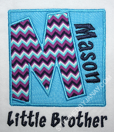
For little unnamed brother, I printed a template of the design and pinned it to a onesie with the fabrics I plan to use. I love this little chevron print, and it will look good with the aqua blue for little brother!
UPDATE:
Little brother Mason has arrived! I'm anxious to see them in their matching shirts. :)
Saturday, September 15, 2012
Box Font!
I need another applique font like I need another hole in my head. But EVERY.SINGLE.TIME. I see a picture of the Box Font from The Itch 2 Stitch in use I think, "I have GOT to have that!" After a flurry of comments on an applique group (when I solicited suggestions for an upcoming project) AND a surprise coupon code listed on I2S's Facebook page (good through Sunday), I snatched it up.
I was at Hobby Lobby looking at fabric for a different project when my three year old son grabbed a bolt off the shelf and asked, "Mommy, can you make me a Lightning McQueen shirt???" When I saw the fabric my first response was no -- that big print just wouldn't work in an applique design. He asked again nicely (that alone is worth a reward!) and I remembered the Box Font and said YES! Why did I hesitate? I have got to take advantage of him making requests now while he still wants mommy-made shirts.
Here's a close-up of the results. I2S's Box Font and I added his name with Gadzooks from 8CP.
What do you think of my placement of the Lightning McQueen fabric? I'm pretty pleased with it, let me show you what I did. I printed a template of the design and trimmed out the D. Then I moved it all over the fabric trying to find a good spot.
I took several pics with my phone, and this turned out to be the view that was the best.
So I marked the outline of the D on the fabric with my water-soluble pen, and then in the hoop I lined up my marks with the placement stitches. Worked perfectly!
While in my head I loved the idea of using the checkered flag fabric as the background, in reality I think it's too busy. While you can read his name pretty well in that close-up image above (courtesy of the camera flash), when you step back it's hard to read, and overall it just looks a bit busy. See what I mean?
Thankfully Dashiell doesn't mind. :) It was a good learning experience and I'm so glad I did his first. It has helped me confirm my fabric selection for the next project using this font! Stay tuned...
I was at Hobby Lobby looking at fabric for a different project when my three year old son grabbed a bolt off the shelf and asked, "Mommy, can you make me a Lightning McQueen shirt???" When I saw the fabric my first response was no -- that big print just wouldn't work in an applique design. He asked again nicely (that alone is worth a reward!) and I remembered the Box Font and said YES! Why did I hesitate? I have got to take advantage of him making requests now while he still wants mommy-made shirts.
Here's a close-up of the results. I2S's Box Font and I added his name with Gadzooks from 8CP.
What do you think of my placement of the Lightning McQueen fabric? I'm pretty pleased with it, let me show you what I did. I printed a template of the design and trimmed out the D. Then I moved it all over the fabric trying to find a good spot.
I took several pics with my phone, and this turned out to be the view that was the best.
So I marked the outline of the D on the fabric with my water-soluble pen, and then in the hoop I lined up my marks with the placement stitches. Worked perfectly!
While in my head I loved the idea of using the checkered flag fabric as the background, in reality I think it's too busy. While you can read his name pretty well in that close-up image above (courtesy of the camera flash), when you step back it's hard to read, and overall it just looks a bit busy. See what I mean?
Thankfully Dashiell doesn't mind. :) It was a good learning experience and I'm so glad I did his first. It has helped me confirm my fabric selection for the next project using this font! Stay tuned...
Friday, September 14, 2012
For this child I have prayed
God has done a mighty work in the lives of my brother and sister-in-law! The existence of my niece is a testimony to the power of prayer. 1 Samuel 1:27 is printed on the wall above her crib, so when I saw this new design from Lynnie Pinnie, I knew immediately I would use it on a project for Gabriella.
Her name was digitized for me using the font Mister Giggles. Here is a close up of the 1 Samuel 1:27 design, isn't it lovely?
This little romper dress has been in my stash forever. Annaliese received it as a baby gift over eight years ago. I can't recall if she ever wore it, but I always hung on to it, so sweet and simple. I decided this was the time to upcycle and hand down. :)
Can't wait to see a picture of Gabriella in it!
(and if my other baby niece is thinking, "hey, what about me?" someday an unexpected surprise will arrive in your mailbox, too.)
Monday, September 10, 2012
First Birthday, celebrating hippo style!
Hollie asked me to make a shirt/bib set for her daughter to wear on her first birthday. Her initial email was filled with ideas -- Hollie had done tons of searching herself before contacting me. She sent links to several designs or completed shirts that she liked, but none of them were exactly what she envisioned. I did a bit more sleuthing, and discovered one thing for sure -- there aren't a lot of cute hippo designs out there! At least not full body hippos that were positioned the right direction. After some design editing and merging, here's what I came up with:
to coordinate with this Sweet Safari party decor set:
The hippo applique design is actually this Behemoth design I found on etsy. I knew nothing about the seller nor the quality of the designs, but told Hollie I was willing to give it a try. I did so much design manipulation that I can't honestly give an opinion on the original digitizing, but the seller was very prompt in communication!
I removed several elements from the behemoth, added an applique hat and little embroidered bows that I plucked off of some LP designs in my stash, as well as this free balloon design. I think it turned out pretty cute! It certainly was a fun challenge!
Sunday, September 9, 2012
Whooooooo loves perfectly placed designs?
This is part two of my recent applique owl extravaganza. You can see all the cute pictures of my daughter in her new items as well as all the Lynnie Pinnie design info in part one: Whooooooo loves owls?
These designs feature either an owl or a trio of owls sitting on a branch, which extends farther to the right than the left. Asymmetrical designs like this require extra care when placing the design on your project. To quote my friend Kaycee, "Scrolls, swirls and tails generally should be mostly ignored. Center the "BULK" of the design or font. That's my rule of thumb anyway :)" It's MY rule of thumb, too! As much as it pains this mathematician to say it, often the technical center of a design is not the most visually pleasing. Even if you measure and mark the exact center of your shirt and perfectly center the embroidery design file, it may look off when you are all done.
Before proceeding, I have some required reading for you. Please follow this link to read "Centering those Off-Center Appliques" by Rosemary of Applique Cafe. She does a great job explaining the situation with several visuals, showing how she accounts for off-center designs within her software before heading to the embroidery machine. Most of the time I use a similar technique. Go read and come right back. :)
In the case of this design however, the design completely filled the width of my hoop and I couldn't shift it left or right. The black line represents the center of the design. But the blue line shows where the center should fall to be the most visually pleasing. It's about 15mm off. And it's amazing what a difference 15mm can make!
One of the easiest solutions is to print a template, trim around the design, lay it on the shirt where it looks *just* right, draw in your axes and hoop the shirt. (You can see an example of that here.) But I'm pretty cheap when it comes to using our printer and I don't want to waste the precious ink. :) Instead I look at the design in Embird and use my hoop templates to help me get my design placement perfect.
For this pink shirt I folded it in half vertically and made a little mark with my water soluble pen where the center of the shirt was. I knew I wanted to shift my design 15mm to the right so the center of the owl lined up with the center of the shirt.I laid my hoop down in the appropriate spot and then marked my design placement. I'm sorry this is a terrible picture. I started composing this blog post in my head too late to get good pictures so I just grabbed my phone. Can you see the little mark on my shirt 15mm to the left of the center of my template?
When I was done, my shirt looked like this. The owl looks centered, yay! The branch extends farther off to the right, but that's ok.
After doing this design I decided to take better pictures in the process of my second shirt. Again, the leaves on the branch make the overall design appear off-center. The black line is the axis of my hoop, but the blue line is what looks like the center to me:
I folded my shirt in half, pressing the center line:
Then since I wanted to shift my design 10mm to the right, I laid my hoop with the center axis 10mm to the right of my fold (kind of hard to see...) I marked the center and axes, drew my lines and hooped it!
Hope that helps save you from stitching a flawless embroidery design, removing it from the hoop and thinking, MAN, that does NOT look right!! :)
These designs feature either an owl or a trio of owls sitting on a branch, which extends farther to the right than the left. Asymmetrical designs like this require extra care when placing the design on your project. To quote my friend Kaycee, "Scrolls, swirls and tails generally should be mostly ignored. Center the "BULK" of the design or font. That's my rule of thumb anyway :)" It's MY rule of thumb, too! As much as it pains this mathematician to say it, often the technical center of a design is not the most visually pleasing. Even if you measure and mark the exact center of your shirt and perfectly center the embroidery design file, it may look off when you are all done.
Before proceeding, I have some required reading for you. Please follow this link to read "Centering those Off-Center Appliques" by Rosemary of Applique Cafe. She does a great job explaining the situation with several visuals, showing how she accounts for off-center designs within her software before heading to the embroidery machine. Most of the time I use a similar technique. Go read and come right back. :)
In the case of this design however, the design completely filled the width of my hoop and I couldn't shift it left or right. The black line represents the center of the design. But the blue line shows where the center should fall to be the most visually pleasing. It's about 15mm off. And it's amazing what a difference 15mm can make!
For this pink shirt I folded it in half vertically and made a little mark with my water soluble pen where the center of the shirt was. I knew I wanted to shift my design 15mm to the right so the center of the owl lined up with the center of the shirt.I laid my hoop down in the appropriate spot and then marked my design placement. I'm sorry this is a terrible picture. I started composing this blog post in my head too late to get good pictures so I just grabbed my phone. Can you see the little mark on my shirt 15mm to the left of the center of my template?
I folded my shirt in half, pressing the center line:
Then since I wanted to shift my design 10mm to the right, I laid my hoop with the center axis 10mm to the right of my fold (kind of hard to see...) I marked the center and axes, drew my lines and hooped it!
Hope that helps save you from stitching a flawless embroidery design, removing it from the hoop and thinking, MAN, that does NOT look right!! :)
Saturday, September 8, 2012
Whooooooo loves owls?
We sure do! Last weekend I stitched owls exclusively, it was fun!
I've had this shirt/shorts set sitting on my sewing table for weeks now, waiting for an applique design to be added. We had settled on an ice cream cone, but I just hadn't gotten around to it. And once school started, Annaliese decided it was too late to do ice cream. In walks Lynnie Pinnie to save the day! This outfit turned out to be the perfect canvas for the Owl on a Branch design.
I picked the brown and peach fabrics to match the colors in her shorts. I debated a while what other color to throw in the mix since the owl needed more variety, and realized I'd be using green on the leaves, why not? I love how it turned out!
Lyndsie also created Owl Felt Clippies. I picked hot pink felt for the base, and used the same peach floral fabric for the body.
Makes a cute set, right??
Then I put the Stacked Owl Trio design on a long sleeved shirt, and someone else got a new tee, too!
This design comes in 4 sizes. I was going to use the smaller 6x10 size, but Annaliese really wanted me to use my new Riley Blake chevron fabrics... who could blame her?! So I jumped to the larger 6x10 size to try to showcase the fabric as much as possible. Here's a quick cell phone pic I took in the process of sewing, I was pleased as punch with my fabric placement!
Let me brag on Miss Lynnie Pinnie for a moment. This design was fabulously digitized (as always). I love the way the fabric was tacked down, starting with the top owl and moving down. I was able to use scraps from trimming the orange owl to do the wings on the purple owl, and then use scraps from trimming the purple owl as the wings on the pink owl. Each owl has seven thread colors on it, but the pathing and sequencing for these was so perfect that each thread was only in the machine once! It was just amazing.
Lyndsie also released a couple different small owl designs. Annaliese picked the Small Owl applique to go on a shirt for her American Girl Doll (and the coloring of the middle owl). This design was the perfect size!
Ok, I have more to say about my design placement for these shirts, but this post is long enough! So I'll include that info in a separate post.
Subscribe to:
Posts (Atom)